The Ishikawa Philosophy
Dr. Kaoru Ishikawa is regarded as the father of the Japanese quality movement. An engineer by trade, his approach to quality was a bottom-up, participative approach that is the defining trademark of the Japanese quality movement. This led to their becoming an industrial quality world leader in the 1980s. He was a strong proponent of the Feigenbaum philosophy and believed that all quality began and ended with the customer’s needs. Dr. Ishikawa is most widely known for developing a popular quality improvement tool called the cause-and-effect diagram, also called the fishbone diagram or the Ishikawa diagram (Evans & Lindsay, 2020).
Below is an example of an Ishikawa diagram:

The Effect is the issue you are trying to solve. The Causes are the possible reasons why the issue, or Effect, is happening. The Symptoms are the possible explanations or reasons for the Causes.
File(s) needed: None. Student will create an original file.
Steps:
- Using either Word or PowerPoint, create a file named LastName_Ishikawa (where LastName is your actual last name).
- Utilize the Illustrations tool to create an Ishikawa diagram similar to the example above.
- Identify an Effect that you wish to solve. It can be any problem, such as your computer won’t start or an illness you are feeling and want to identify what it is. Think carefully about this topic, and if you need help identifying an Effect, please ask your instructor for ideas.
- Identify six areas (Causes) that may contribute to the effect by drawing from your personal/professional experiences, the knowledge you have developed from other courses, or research you have done on the topic.
- Identify no less than three symptoms for each cause.
- Attach and submit your file for grading.
Pareto Chart
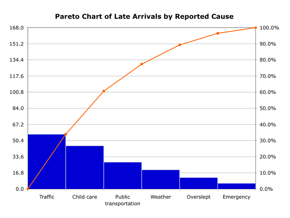
A Pareto chart often follows the creation of an Ishikawa chart or other method of identifying causes of failure. Now that those causes have been identified, they are classified by severity. Here is an example of the chart

The Pareto chart has data on three axis. On the left Y axis is the frequency of cause occurence. On the lower X axis the causes from the Ishikawa. Note that the symptoms are not included. Only the causes. On the right Y axis is the overall percentage. The percentage should always scale from 0% to 100%. The chart should caputre all of the known casues for this issue. If a new cause is found then it should be classified and added to the chart.
How is a Pareto chart used?
Now that the causes of failure and their frequency have been identified, resources can be assigned based on this information. In most cases, the causes would be corrected in order starting with the one that most frequently happens. In the graph above, traffic has the largest occurence. Maybe a mass communication is sent out ensureing that everyone checks Google/Apple maps before leaving their home.
In some cases causes can be worked on simultaneously depending on the organization. The idea is the same though. Now that management knows what the causes are and how frequently they happen, resources can be better utilized to correct those causes.
File(s) needed: None. Student will create an original file.
Steps:
- Using Excel, create a file named LastName_Pareto (where LastName is your actual last name).
- Create two column data chart listing all causes in one column and their frequency in the second. For this exercise, use your best judgment in determining the scope and scale of the frequency numbers. If your causes are car related, maybe this is failures over the course of a fleet. If it is home related, maybe all homes in a city. Use your best and reasonable judgment.
- Use Excel to create a Pareto chart. Search Excel help if needed.
- Modify the chart to give it a title and change the style to one that is not the default.
- Attach and submit your file for grading.


