Create a scatter chart and add a trendline
Guaraldi and Associates is a management consulting firm located in Manhattan. The firm is interested in examining the relationship between the amount of vacation that their consultants use per year and how long the consultant has been with the firm. All consultants at Guaraldi and Associates, other than the Managing Partners, are considered either Junior Consultants or Senior Consultants based on their skills and expertise. The file GuaraldiConsultants contains data on all Junior and Senior Consultants at Guaraldi and Associates including the years of service the consultant has at the firm and the number of hours that the consultant took as vacation last year.
(a) Create a scatter chart and add a trendline to examine the relationship between years of service and amount of vacation time used for all consultants at Guaraldi and Associates. Based on the scatter chart, what appears to be the relationship between years of service and amount of vacation time used?
There appears to be <SELECT> relationship between years of service and amount of vacation time used.
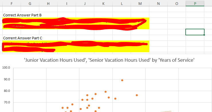
(b) Create a scatter chart for the same data, but this time differentiate the points in the scatter chart based on whether the consultant is junior or senior. Do you see the same relationship in this scatter chart individually for junior and senior consultants as you saw in part a for all consultants?
- Based on this scatter chart and trendlines the relationships for junior and senior consultants appear to be different from the relationship from part (a) for all consultants.
- Based on this scatter chart and trendlines the relationships for junior and senior consultants appear to be the same as the relationship from part (a) for all consultants.
- Based on this scatter chart and trendlines the relationship for junior consultants appears to be the same as the relationship from part (a) for all consultants and the relationship for senior consultants appears to be different from the relationship from part (a) for all consultants.
- Based on this scatter chart and trendlines the relationship for junior consultants appears to be different from the relationship from part (a) for all consultants and the relationship for senior consultants appears to be the same as the relationship from part (a) for all consultants.
(c) Do the results in parts (a) and (b) provide an example of Simpson’s paradox? Why or why not?
- 1. No, because the trend that appears in the complete data set disappears when the data are split into subgroups.
- 2. Yes, because the trend that appears in the complete data set also appears when the data are split into subgroups.
- 3. No, because the trend that appears in the complete data set also appears when the data are split into subgroups.
- 4. Yes, because the trend that appears in the complete data set disappears when the data are split into subgroups.
SOLUTION

There appears to be XXXXXXX relationship between years of service and amount of vacation time used.
…Please click on the Icon below to purchase the FULL ANSWER at only $5


